CONTEXT
Through usability testing, cognitive science research on how people learn, and best UX practices, I created CMS templates that helped writers optimize health information for the general public and health care providers.
GOAL
Make CDC content easier to read. Platform most important information first. Reduce redundant information and standardize CDC pages across different topics.
Scope
Team: 1 Content designer, 2 UX designers, 5 UX researchers
Because of my diverse skillset, I was the only member who participated in the entire product lifecycle as a content designer, UX designer, and researcher on this project.
ANALYSIS
How do we help health communicators organize important public health guidance so that the general public can easily digest it?
Categorize content and come up with best practices for each subset. I'll go over the process I used to write the "Clinical Guidance for Pregnant and Breastfeeding People" content type.
1. Analyze ~20 current CDC webpages by doing a heuristic analysis and looking for common elements.
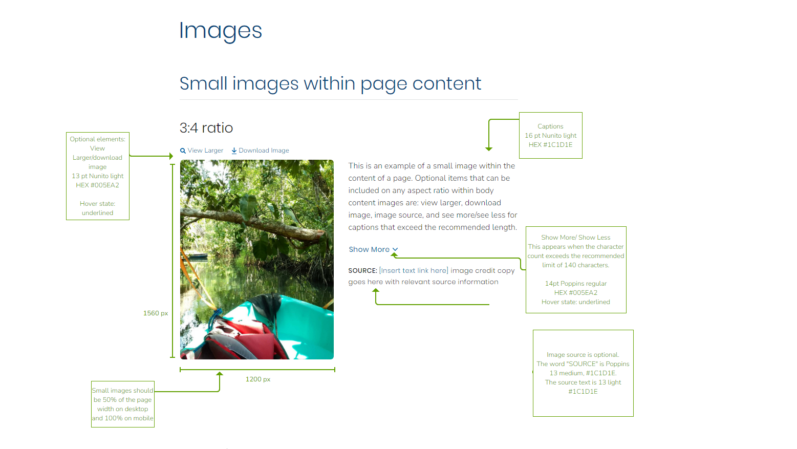
2. Create an excel "template" with pre-defined heading options, description, and whether the section is optional.
Content type template
USABILITY TESTING
3. Build out test pages using the template.
4. Conduct usability testing. We conducted moderated studies on usertesting.com with 240 participants for 30 templates and recruited for a diversity of ages, gender, and clinical knowledge.
DATA ANALYSIS
I watched all the recordings from usertesting.com and coded them for salient points including "success," "failure," "praise," and "criticism." Additionally, I looked for overarching trends, impactful sound bytes to share with our stakeholders, and wrote 3-7 page word reports for each content type, which I won't share here for brevity but email me if you would like to read them.
The UX researchers combed through the reports and created a slide deck with salient points to share with key internal stakeholders from the content design and UI design teams as well as our clients.
Key takeaways from the "Clinical Care and Treatment for Pregnant and Breastfeeding People" content type testing
Example of a general takeaway from the holistic analysis
ITERATING
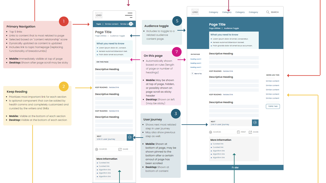
Based on testing results, we updated the template guidelines with more specific heading options and created "writing guidance" for health communicators.
Then, we released these templates into the wild and got feedback from health communicators and continued to update and refine the templates to meet their needs while considering the end user (website visitor's) needs.
RESULTS
- Over 90% success rate for users finding information on CDC's website
- Reducing redundant content on CDC's site by 60%
- Increased satisfaction (qualitative interviews) from the public and health care providers!
- Reducing redundant content on CDC's site by 60%
- Increased satisfaction (qualitative interviews) from the public and health care providers!
"Everything's short and sweet and to the point. It's not like an encylopedia!"- Desktop user
"I can just go to each topic and just read information about it and not scroll through everything." - Mobile user
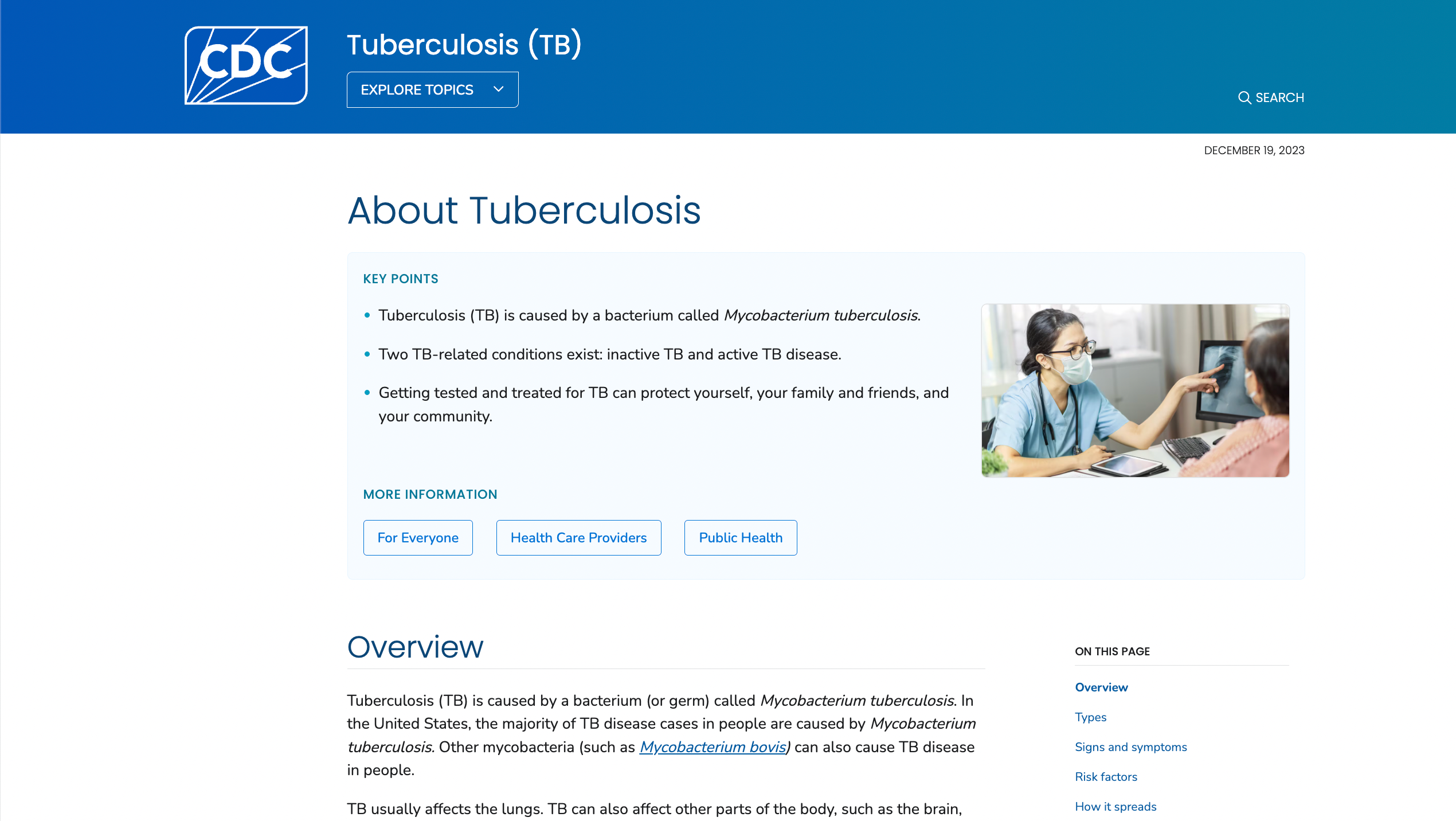
See example of a template in use on CDC's website today below.
AREAS FOR IMPROVEMENT
In an ideal world, I would have liked to speak with health communicators at the beginning of and throughout this project, since these templates are supposed to expedite their writing process.
In an ideal world, I would have liked to speak with health communicators at the beginning of and throughout this project, since these templates are supposed to expedite their writing process.
However, we did not have access to them and our workaround was to consider the content on the current website, any related support tickets, and use UX principles around clarity, front-loading important information, and page hierarchy to create optimal layouts.
There is also a tension because while we are creating a B2B product that should be easy to use for the health communicators, there is always the tension that what is easiest for health communicators may not be what is the best for the end user. To account for this, we "hard-coded" some items into the template to advocate for the end user, knowing that health comms are not necessarily thinking about UX principles the way we are.


