CONTEXT
Are homepages necessary for each topic on CDC's website? Do users expect them? We investigated this question in this project.
SCOPE
Team: 1 designer (me), 1 PM, dev team
Timeline: 1 month design/test/develop cycle
USABILITY TESTING
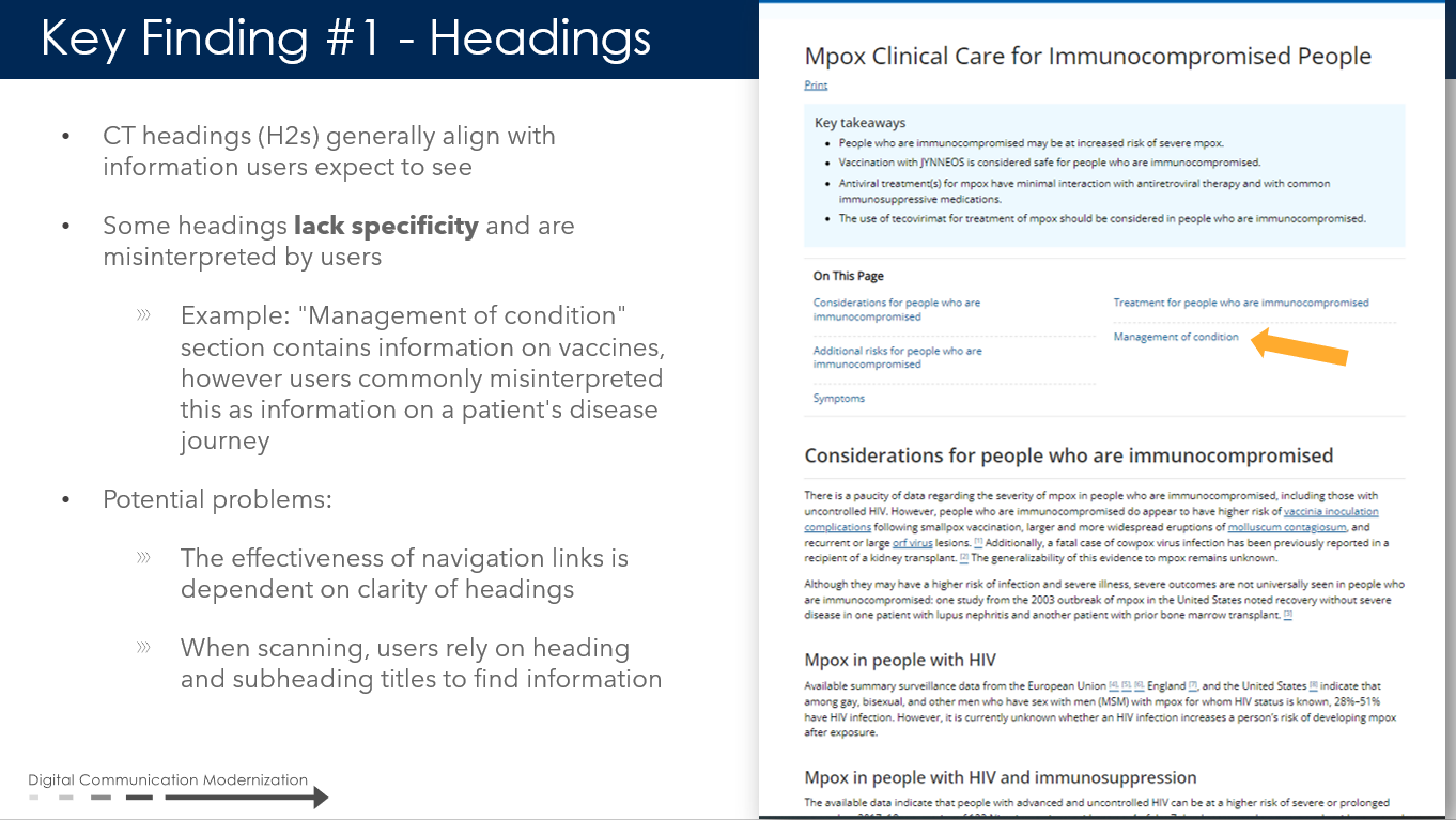
During usability testing, we observed a trend that users repeatedly navigated to the "About [topic]" link when they were looking for more information about a topic. All this information is usually kept on the topic homepage but users rarely expected there to be a homepage for each topic or to navigate there.
See the "About Tuberculosis" and "Tuberculosis Homepage" for comparison.
This is the About Tuberculosis topic page
This is the Tuberculosis homepage
SOLUTION
The design had to be:
1. cohesive with the rest of the page styles
2. easily noticeable
3. small- there was no more real estate for a large menu or additional widget on the page
1. cohesive with the rest of the page styles
2. easily noticeable
3. small- there was no more real estate for a large menu or additional widget on the page
So we added three buttons in the top blue section with a sub-heading MORE INFORMATION.
1. Cohesive: We were already using the these buttons for other page designs so they were cohesive with the design system.
2. Visible: They were at the top of the page in the blue box. Based on holistic testing, we knew that most users gravitated toward this section of the page first. So if they're looking for other information, they can easily find it.
3. We just added 3 small buttons that did not take up too much space or add visual noise to the page. Clicking on the buttons leads to the site index, a list of all pages about the topic.
REFLECTION
High impact projects don't always have to involve flashy designs or a heavy lift. It's always about identifying the problem at hand and devising the best solution (in terms of level of effort, design coherence.) This is an example of a simple project that significantly improved usability for our users.


