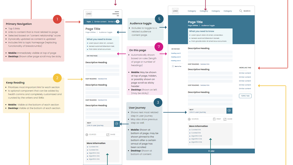
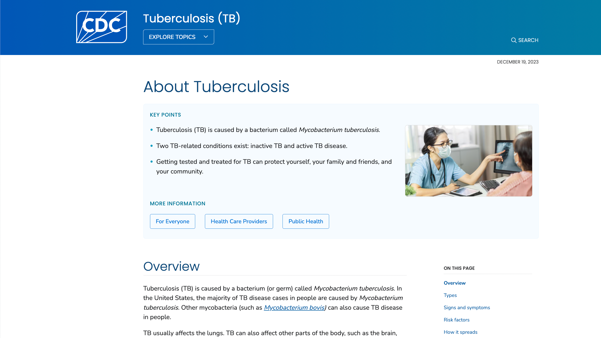
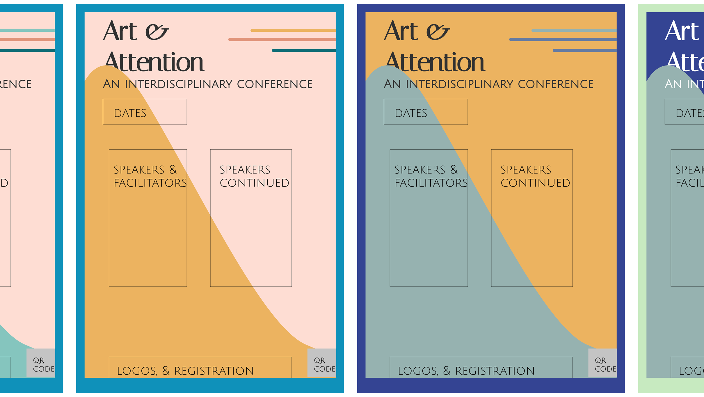
I helped to define CDC fonts, colors, and components and created style guides and rationale documents for the broader UX + development team.
Overview
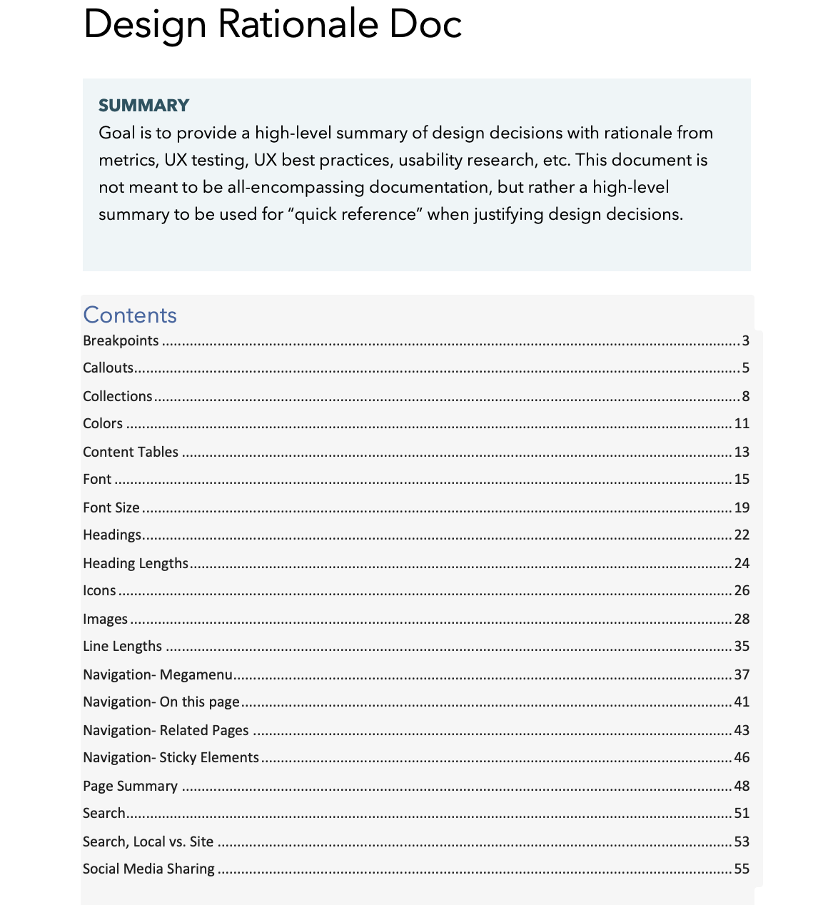
I developed a style guide and 50+ page rationale document to ensure consistency across all CDC digital products and help the broader product team understand design decisions. UX design is not just the UI, but rather being able to explain decisions based on testing and usability principles.
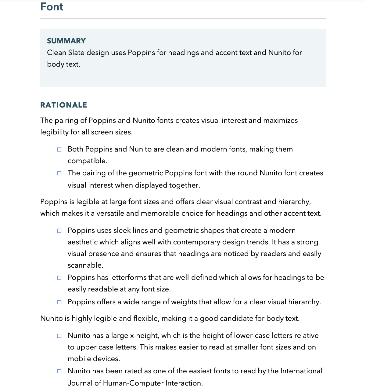
Typography style guide
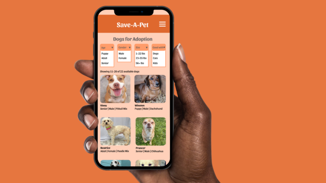
Images style guide
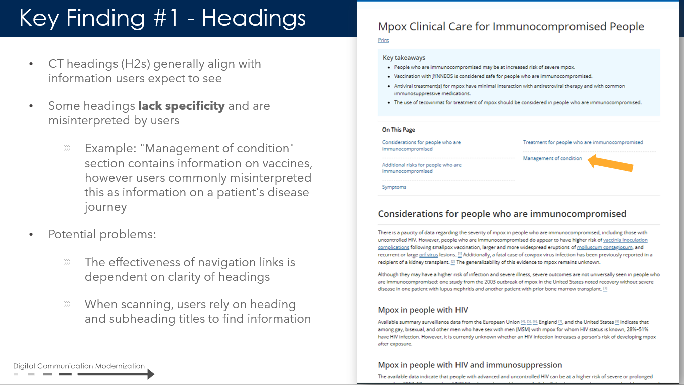
DESIGN RATIONALE
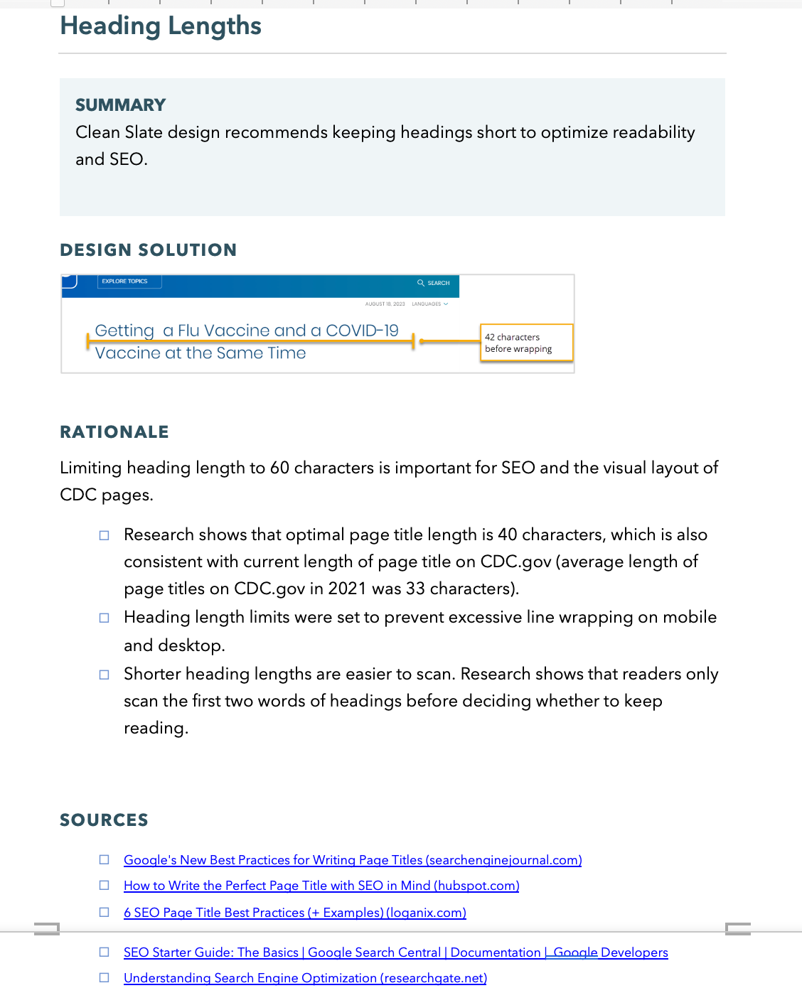
In additional to technical specs, I explained design decisions based on testing, design principles, and our system limitations. I gathered reference links and compiled it all into a easy to read document for the broader product team. We often get questions about our designs, "why did we do X? And why not do Y instead?" This guide is an initial answer to those questions and shows the thought and research that went into each design decision. See a few excerpts below.
