Can you imagine having to call your pharmacy every time you want to reorder your medications in 2026? Due to legacy software constraints and the highly regulated medications offered, a branch of Walgreens is still only processing orders telephonically. There have been several failed attempts previously but our team broke down the red tape and successfully launched a digital experience, leading to high patient satisfaction and continued cost savings.

CONTEXT
Walgreens Community Specialty pharmacy serves over 600,000 patients annually and dispenses medication for treatment-intensive conditions like cancer, HIV, and auto-immune diseases. It's running on 40 year old legacy software and complicated by the fact that pharmacists are required to conduct treatment check-ins on a regular basis.
GOAL
Create a user-centric digital ordering experience that works within the technical constraints.
SCOPE
Time: 1 year
My role: UX designer + UX data research
Team: 2 UX designers, 1 content designer, operations team, development team, 1 product manager
My role: UX designer + UX data research
Team: 2 UX designers, 1 content designer, operations team, development team, 1 product manager
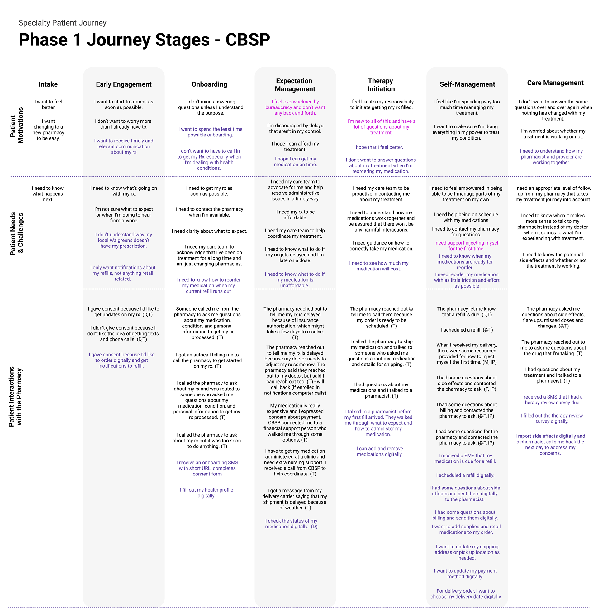
Understanding the patient
The first step was to understand how the patient interacts with the pharmacy. We started with our end-user rather than the system constraints because our team needs to champion the user. Luckily, we had a foundation to draw on from the general Walgreens research repository. We weren't able to talk to any users but were able to talk to the on-the-ground pharmacists who follow the same patients through their healing journeys and validate this journey with them.
Takeaway: Patients expect and value the human connection they have with their own pharmacist, who checks in on them each time they refill their medication and knows them. We want to personalize the digital experience to be warm and assure them that the pharmacist they have established a relationship with is still there to support them.
TECHNICAL SYSTEM AND CONSTRAINTS
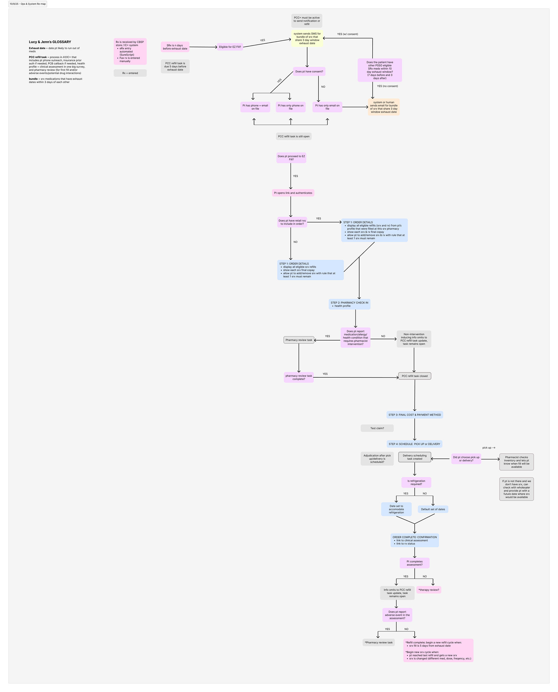
I learned the ins and outs of three different drug processing software. This was the most fun part of the UX process for me because I was able to advocate for the patient and solve technically challenging problems.
My teammate and I created this flow chart to map all of the backend system steps for filling a prescription. This took weeks of learning and validation to get it accurate, but it was well worth the effort because it clarified the complicated system for everyone, not just our team. It turns out no single team knew the whole picture, and now it's finally documented!
Takeaway: When in doubt, map it out, especially when working with stakeholders who are solving the problem from very different angles.
Bonus takeaway: The path of technical least resistance is not always best for the user. In fact, it's probably never the best. Our development team advocated for a two-part experience where a patient places an online order and then comes back half an hour later to finish ordering. It would have been easy to implement with the system constraints but my teammate and I advocated for exploring alternate solutions that reduce friction for the user.
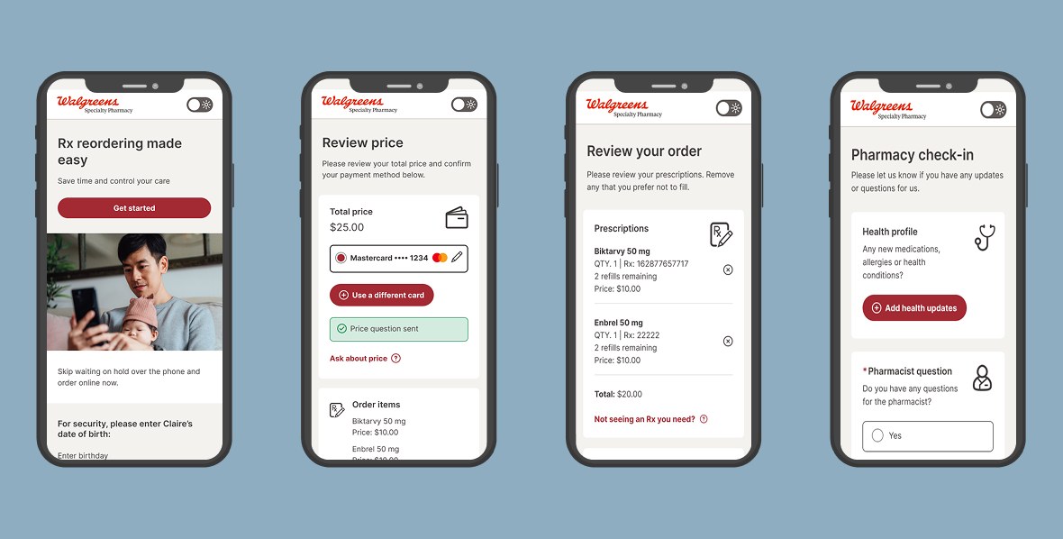
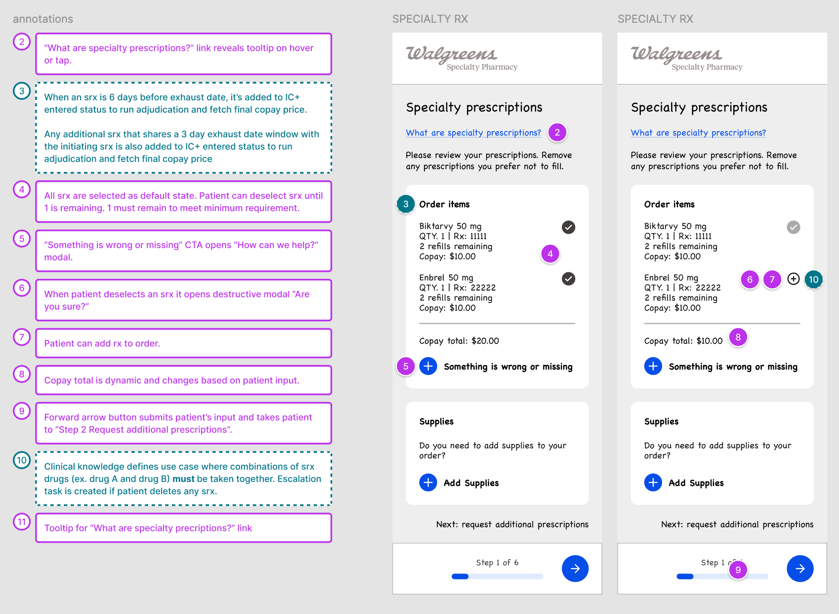
WIREFRAMING
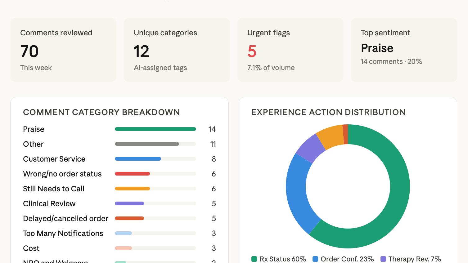
The design element of this project was the easiest part, compared to the stakeholder management and deep technical understanding required to initiate the project. With my data background and access to internal analytics tools, I was able to make data-driven design choices and platform the features most needed by patients.
This is a small sample of the annotated wireframes my teammate and I shared with leadership and other teams to generate a consensus and build an understanding of what resources will be needed to build this out.
Takeaways: The correct response to "we can't do that" is "why?" and "can you tell me more?" If I took every "we can't do that" at face value, we would not have a digital pharmacy. Many constraints are actually just assumptions or a very difficult ask.
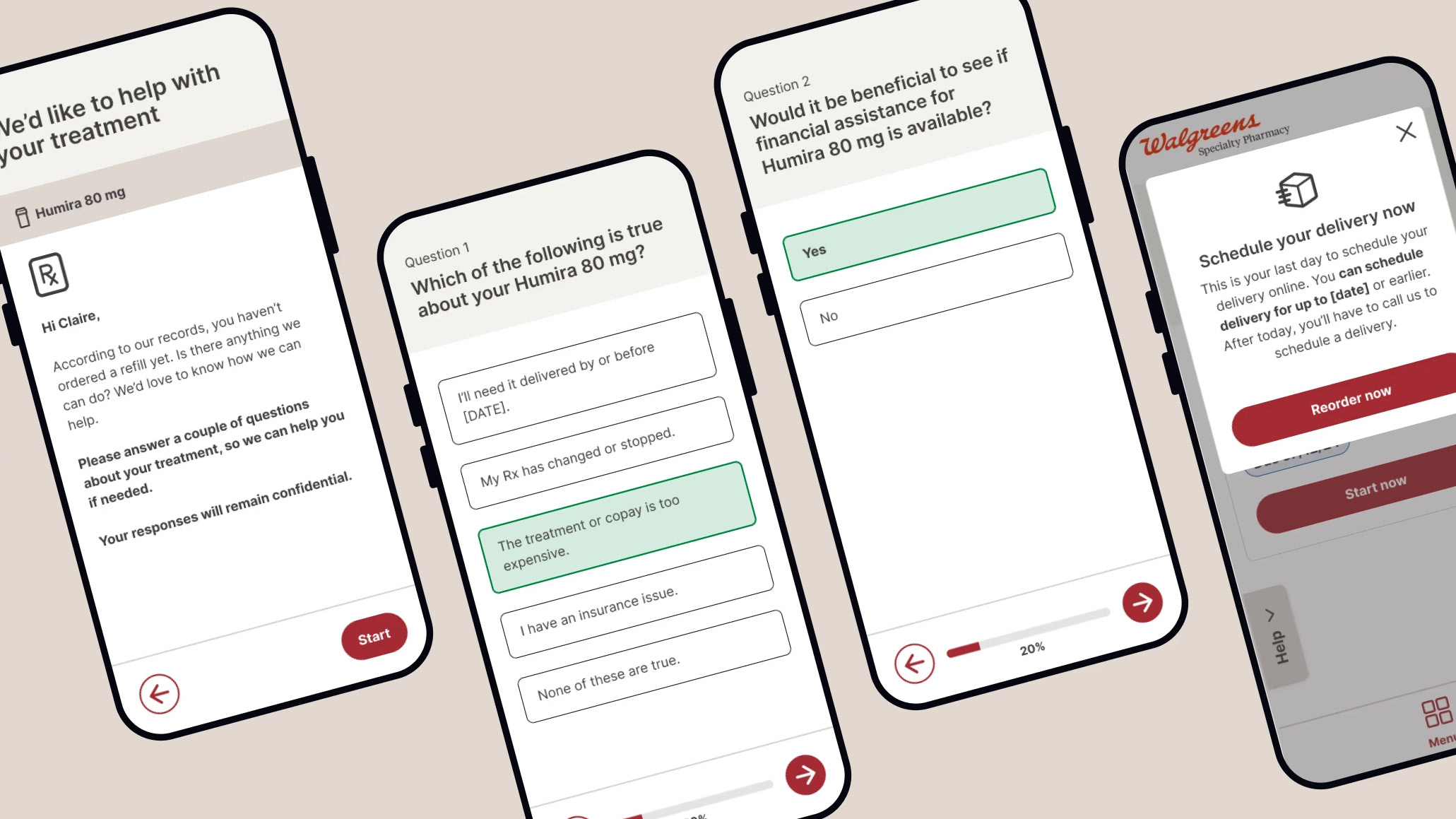
CONTENT DESIGN
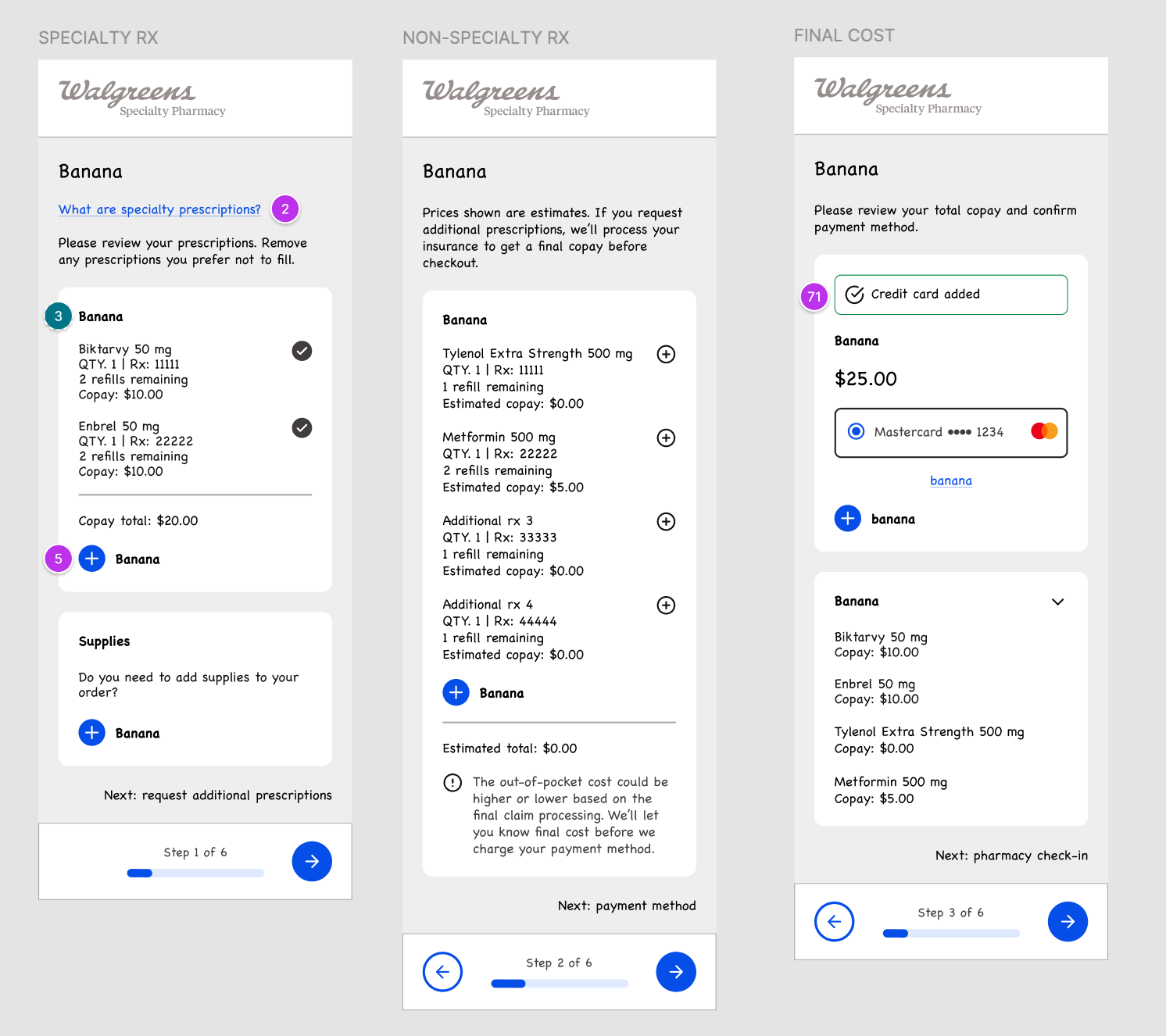
Since we did not have the resources to talk to users, I wanted to try the banana test on our content designer who hadn't seen the low-fi wireframes yet. I replaced all of the keywords with the word "banana" and he filled them in with his best guess based on the context of the page.
Takeaways: Test our assumptions.
We were able to reduce the ordering experience by a whole step based on our content designer's assumptions. Instead of splitting drugs between "specialty" and "non-specialty" which is how the system works in the backend but not how patients perceive their drug ordering, we were able to put it all in one step.
We were able to reduce the ordering experience by a whole step based on our content designer's assumptions. Instead of splitting drugs between "specialty" and "non-specialty" which is how the system works in the backend but not how patients perceive their drug ordering, we were able to put it all in one step.
HI-FIDELITY DESIGN
Design choices:
Choosing a clean but warm look and feel so that patients have clarity but retains the personal touch Walgreens Community Specialty Pharmacies are known for.
Choosing a clean but warm look and feel so that patients have clarity but retains the personal touch Walgreens Community Specialty Pharmacies are known for.
Prioritizing functionality: Large tooltip text isn't always sexy. But I pushed for complying with WCAG AAA standards, both because the accessibility regulations around pharmacy is getting more stringent, but also because we're designing for users who are currently experiencing health crises which might include vision challenges. This was not the easy path because it meant creating new components and updating the library but well worth it.
Work around constraints. I always advocate for usability testing early and often but it was not possible with this flow. So instead, I tested it on my coworkers and leveraged analytics data as well as existing research on existing digital pharmacy experiences. I was able to identify a happy path based on these data points and platform the most useful features for patients and minimize outliers/distractions. For instance, we took out the glaring red button "Missing a prescription?" that was at the top of the ordering page after realizing through looking at our data that it was not going to be a heavy use case.